3 Customization
The theme provides a number of options, which can be set using a key=value interface. The primary way to set options is to provide a comma-separated list of option-value pairs when loading Moloch in the preamble:
\usetheme[
  option1=value1,
  option2=value2,
  ...
]{moloch}
Options can be changed at any time—even mid-presentation—with the molochset() macro.
\molochset{
  option1=newvalue1,
  option2=newvalue2,
  ...
}
The list of options is structured as shown in the following example.
some option [default value, another value, yet another value]
A short description of the option.
3.1 Main Theme
titleformat [regular, smallcaps, allsmallcaps, allcaps]
Changes the format of titles, subtitles, section titles, frame titles, and the text on “standout” frames. The available options produce Regular, SmallCaps, allsmallcaps, or ALLCAPS titles. Note that these commands do not affect math and numbers, so may not work as you expect if your titles contain these.
standoutnumberformat [regular, smallcaps, allsmallcaps, allcaps]
Changes the format of “standout” frames (see titleformat, above).
3.2 Inner Theme
These options control the inner theme, which is responsible for elements like section and subsection pages, as well as the title page layout.
titlepage [moloch, plain, split]
Controls the layout of the title page:
moloch: Moloch’s custom layout with golden ratio vertical spacing and a title separator lineplain: Beamer-like layout with standard vertical spacing and titlegraphic at the bottomsplit: Two-column asymmetric layout with title/subtitle on the left and author/institute/date on the right
\documentclass{beamer}
\usetheme{moloch}

\title{Moloch Theme}
\subtitle{A Minimalist Beamer Theme}
\author{John Doe}
\institute{University of Example}
\date{\today}
\titlegraphic{\includegraphics[width=2cm]{assets/logo.pdf}}

\begin{document}

\maketitle

\end{document}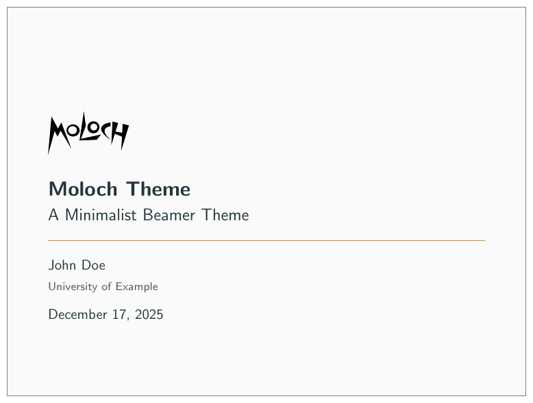
Plain Beamer-like layout:
\usetheme[titlepage=plain]{moloch}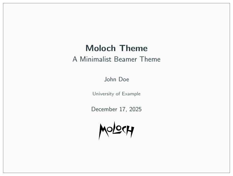
Split two-column layout:
\usetheme[titlepage=split]{moloch}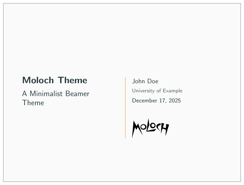
sectionpage [none, simple, progressbar]
Adds a slide at the start of each section (simple) with an optional thin progress bar below the section title (progressbar). The none option disables the section page.
\documentclass{beamer}
\usetheme{moloch}

\begin{document}

\molochset{sectionpage=progressbar} % the default

\section{Section One}

\molochset{sectionpage=simple}

\section{Section Two}

\molochset{sectionpage=none}

\section{Section Three} % Will not have a section page

\end{document}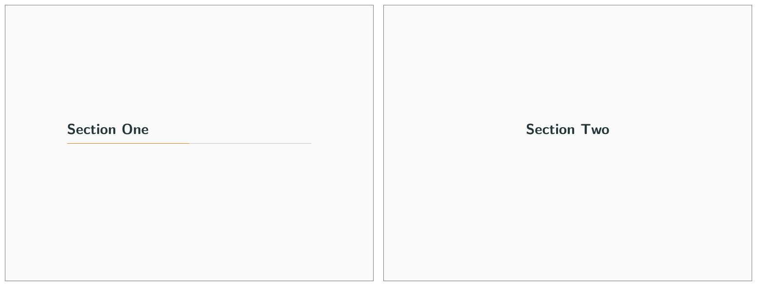
sectionpage options.subsectionpage [none, simple, progressbar]
Optionally adds a slide at the start of each subsection. If enabled with the simple or progressbar options, the style of the section page will be updated to match the style of the subsection page. Note that section slides and subsection slides can appear consecutively if both are enabled; you may want to use this option together with sectionpage=none depending on the section structure of your presentation.
standoutnumbering [none, hide, show]
This option decides whether or not to count standout pages as frames if frame counting. Option none (the default) means that the standout frames are not counted. hide means that they are counted but that there won’t be any footer showing a frame number. show means that they are counted and that the frame number count is shown in the same fashion as for regular frames.
titleseparator linewidth [<dimension>] — default: 0.5pt
Controls the width of the horizontal line that separates the title from the author information on the title page (when using titlepage=moloch). Set to 0pt to hide the separator line entirely.
\usetheme[titleseparator linewidth=2pt]{moloch}3.3 Outer Theme
These options control the outer theme, which is responsible for elements like the frame numbering and progress bar.
numbering [none, counter, fraction]
This option is deprecated and will be removed in a future version. Please use Beamer’s page number in head/foot template instead.
Controls whether the frame number at the bottom right of each slide is omitted (none), shown (counter) or displayed as a fraction of the total number of frames (fraction).
progressbar [none, head, frametitle, foot]
Optionally adds a progress bar to the top of each frame (head), the bottom of each frame (foot), or directly below each frame title (frametitle).
\documentclass{beamer}

\usetheme{moloch}

\begin{document}

\molochset{progressbar=none} % the default

\begin{frame}
  \frametitle{Progress Bar Example}

  The default is to have no progress bar.
\end{frame}

\molochset{progressbar=head}

\begin{frame}
  \frametitle{Progress Bar Example}

  The progress bar is now displayed at the top of the frame.
\end{frame}

\molochset{progressbar=foot}

\begin{frame}
  \frametitle{Progress Bar Example}

  The progress bar is now displayed at the bottom of the frame.
\end{frame}

\molochset{progressbar=frametitle}

\begin{frame}
  \frametitle{Progress Bar Example}

  The progress bar is now displayed in the frametitle area.
\end{frame}

\end{document}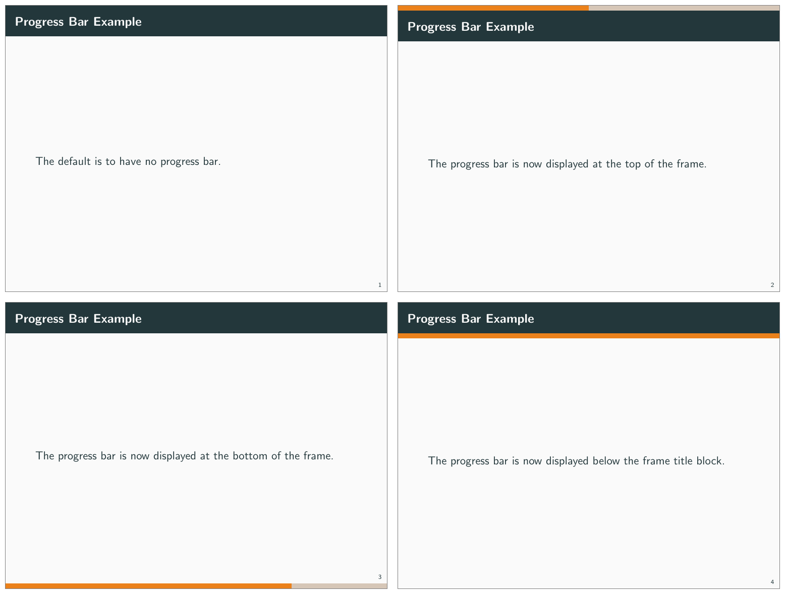
progressbar options.frametitle margin top/bottom/left/right [numeric]
Controls the margins around the frame title. The default is 1.4ex for the top and bottom margins, and 1.6ex for the left and right margins.
\documentclass{beamer}
\usetheme{moloch}

\begin{document}

\begin{frame}
  \frametitle{This is a frame title with default margins}

\end{frame}

\molochset{frametitle margin top=1cm}

\begin{frame}
  \frametitle{This is a frame title with increased top margin}
\end{frame}

\molochset{frametitle margin left=0pt}

\begin{frame}
  \frametitle{And now the left margin is removed}
\end{frame}

\end{document}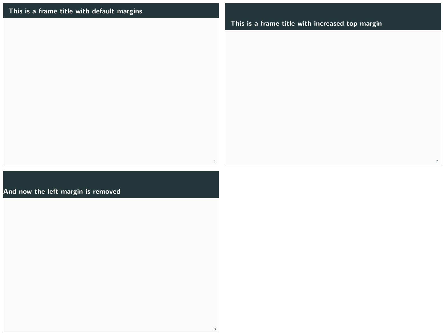
frametitle margin options.3.4 Color Theme
Moloch provides extensive color customization options, from choosing preset color themes to fine-tuning individual colors for light and dark variants.
3.4.1 Color Options
These basic color options control visual aspects of the theme:
block [transparent, fill]
Optionally adds a light grey background to block environments like theorem and example.
\documentclass{beamer}
\usetheme{moloch}

\begin{document}

\begin{frame}
  \begin{block}{Default Block}
    This is a standard block.
  \end{block}

  \molochset{block=fill}

  \begin{block}{Filled Block}
    This is a filled block.
  \end{block}

\end{frame}
\end{document}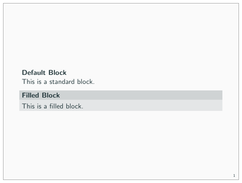
background [dark, light]
This option is deprecated. Use \molochcolors{variant=dark} instead.
Provides the option to have a dark background and light foreground instead of the reverse.
\documentclass{beamer}

\usetheme[background=dark]{moloch}

\begin{document}

\begin{frame}
  \frametitle{Background Color}

  This slide uses the \texttt{background=dark} option, swaps the
  foreground and background colors defined by the moloch theme.
\end{frame}
\end{document}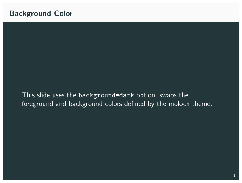
3.4.2 Color Themes
Moloch includes several preset color themes. You can select a theme using the \usecolortheme command or the newer \molochcolors{theme=...} syntax.
3.4.2.1 Default Theme
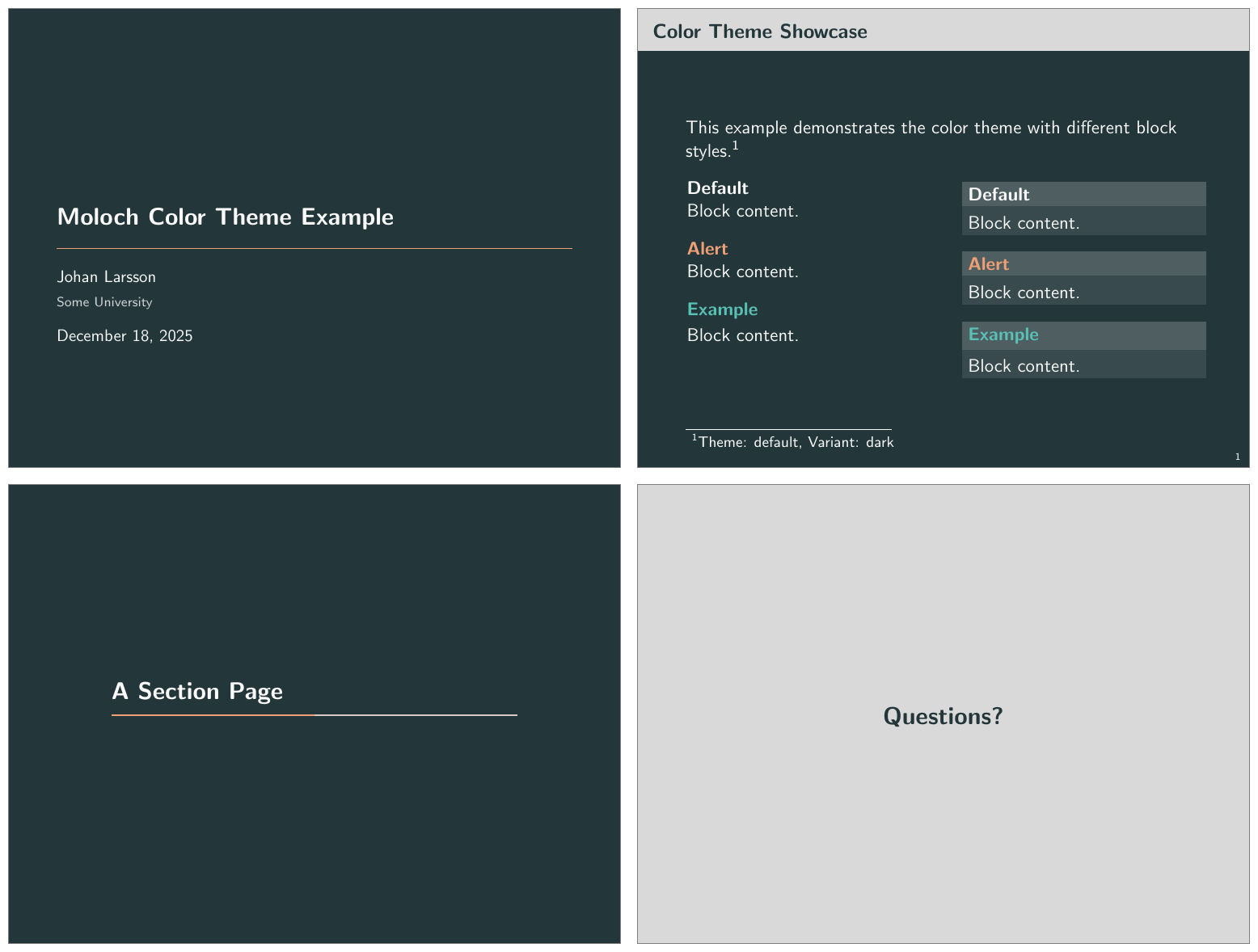
The default color theme is based on the original Metropolis theme, except we have modified the green color for the example blocks to be a bit less saturated.
\usetheme[colortheme=default]{moloch}
% Or equivalently:
% \molochcolors{theme=default}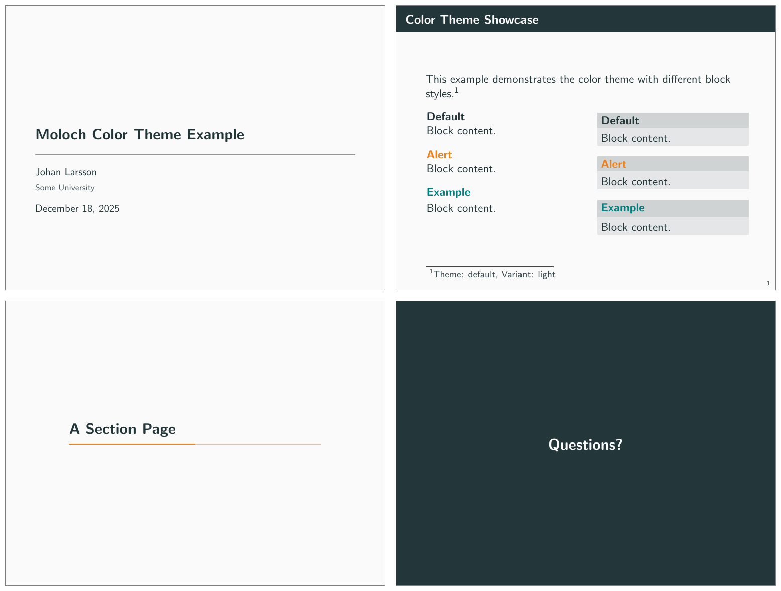
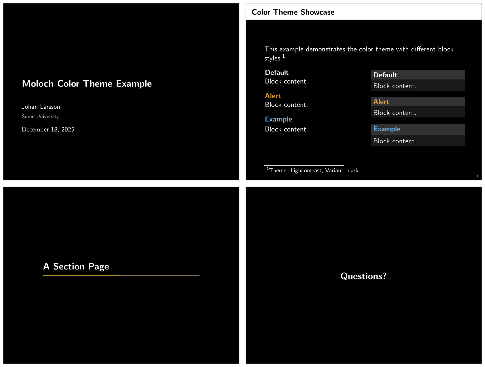
3.4.2.2 The High Contrast Theme
For low-light situations it might be helpful to use the moloch-highcontrast color theme. It uses high-contrast colors adapted from the Okabe-Ito color palette, which is designed to be easily distinguishable by individuals with various types of color blindness. Otherwise, the colors used are mostly black and white.
\usetheme[colortheme=highcontrast]{moloch}
% Or equivalently:
% \molochcolors{theme=highcontrast}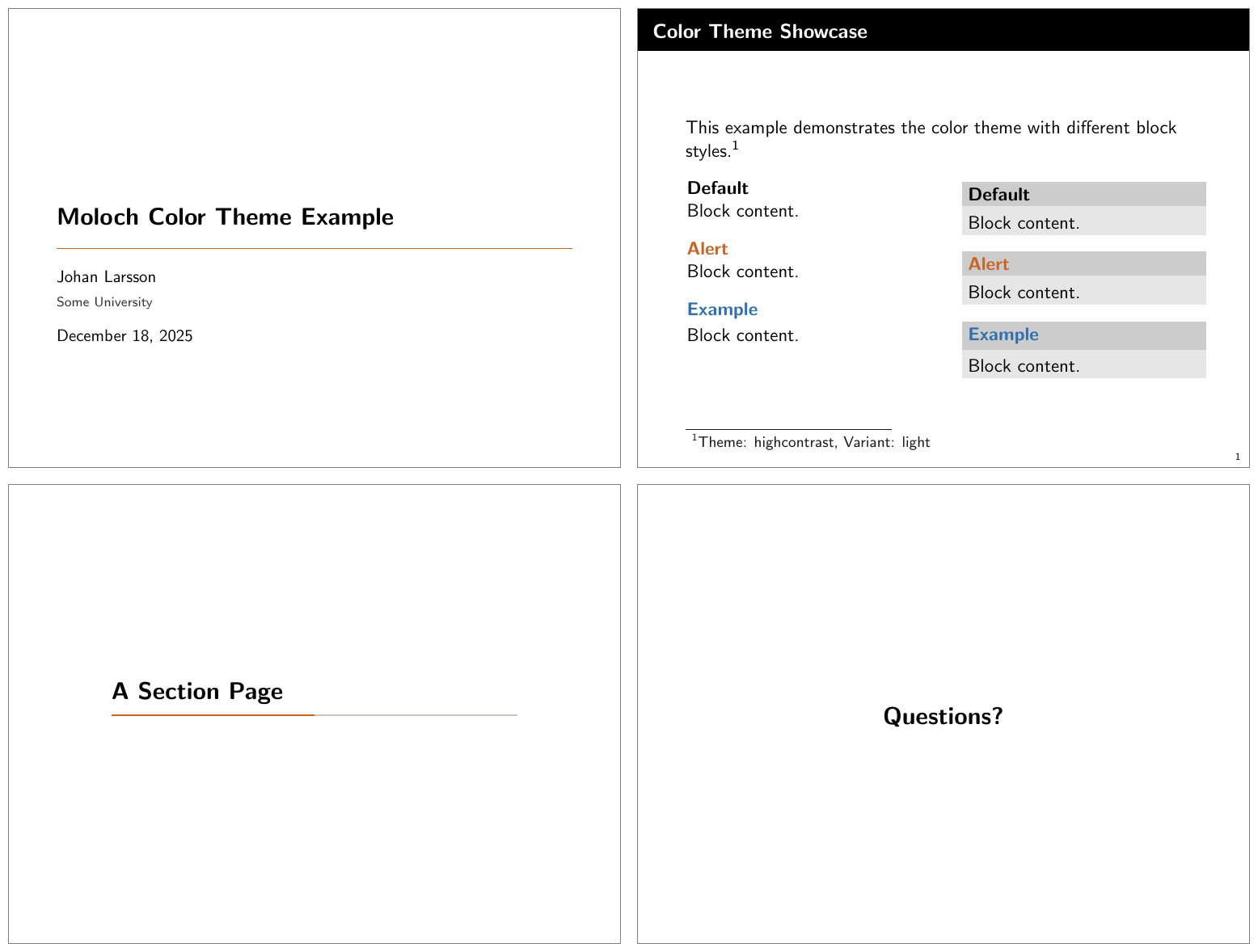
The dark version of the High Contrast theme uses white text on a black.
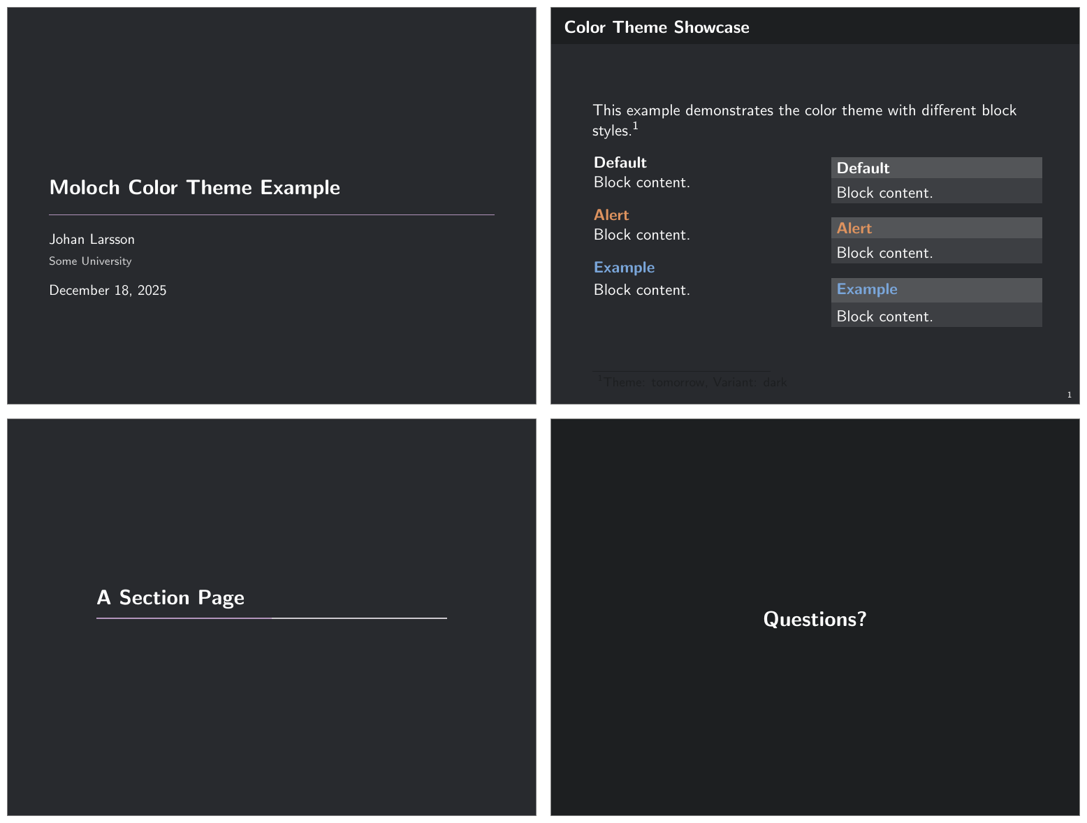
3.4.2.3 The Tomorrow Theme
There is also a theme based on the Tomorrow color theme:
\usetheme[colortheme=tomorrow]{moloch}
% Or equivalently:
% \molochcolors{theme=tomorrow}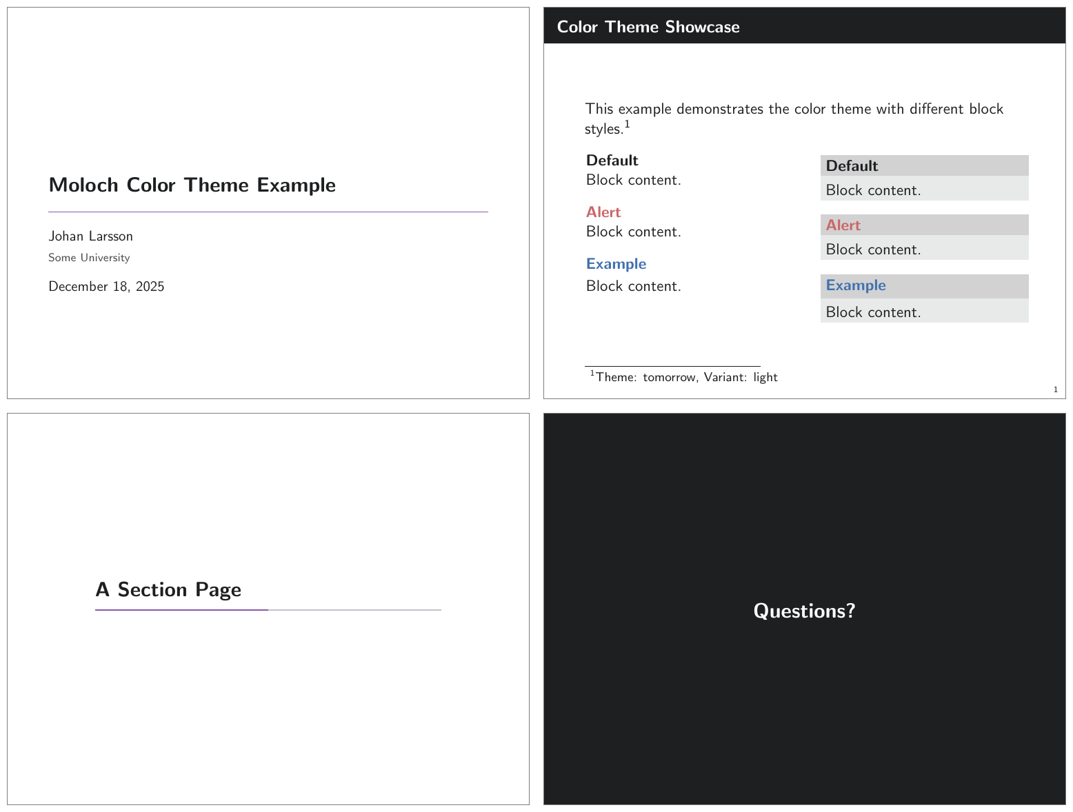
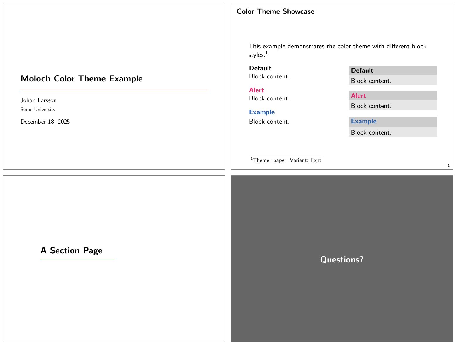
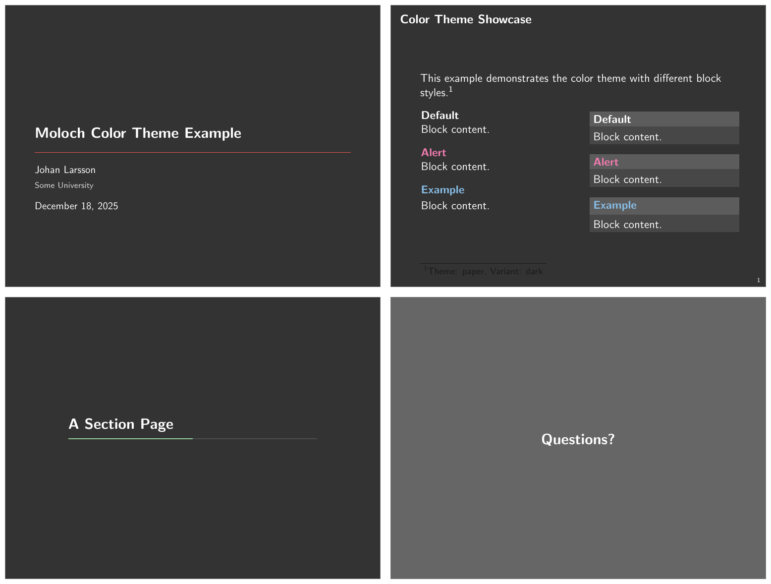
3.4.2.4 The Paper Theme
A minimalistic theme with black text on white background, no frame title background. The colors uses are based on Stephen Few’s Show Me the Numbers book.
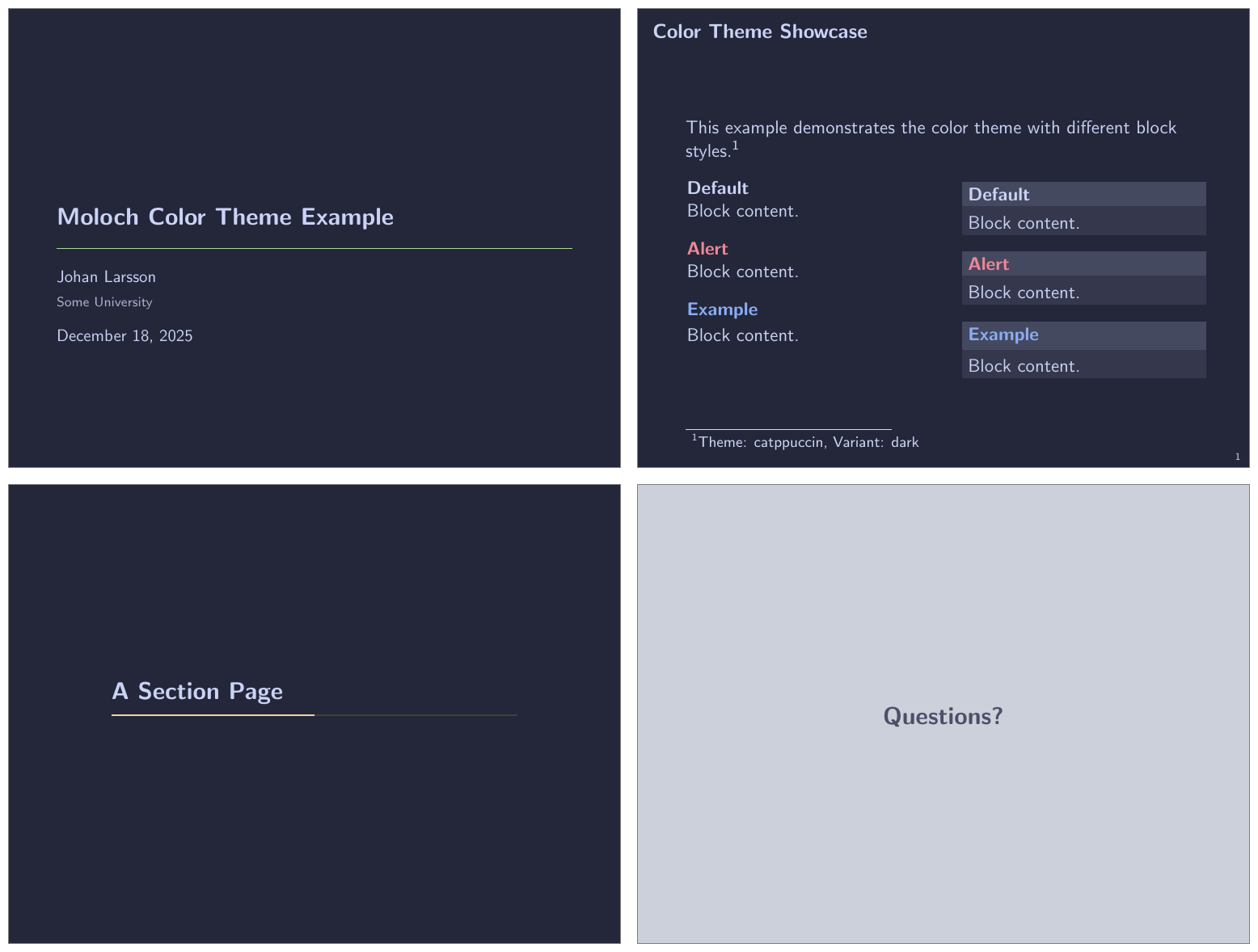
3.4.2.5 The Catppuccin Theme
A theme based on the popular Catppuccin color palette. The themes are based on the Latte (light) and Macchiato (dark) variants. The Cattpuccin theme provides a soft color theme with pastel colors and not a lot of contrast, and might therefore work best for online presentations unless you have a good projector and favorable conditions.
\usetheme[colortheme=catppuccin]{moloch}
% Or equivalently:
% \molochcolors{theme=catppuccin}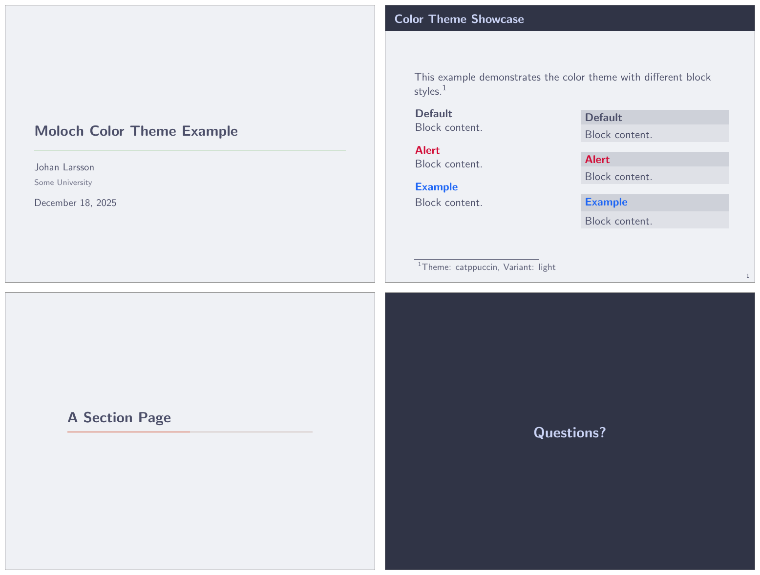
3.4.3 Color Customization
The included Moloch color theme is used by default, but its colors can be easily changed to suit your tastes. Moloch provides two ways to customize colors:
Using
\molochcolors(recommended): A convenient key-value interface for customizing individual colors, especially useful for setting up different colors for light and dark variants. See the detailed documentation below.Using
\setbeamercolor(advanced): For low-level customization or when you need to set colors not exposed through\molochcolors, you can use Beamer’s standard color setting command:
\setbeamercolor{<beamer color name>}{fg=..., bg=...}For example, to customize Moloch-specific colors:
\setbeamercolor{progress bar}{fg=orange, bg=orange!50!black!30}
\setbeamercolor{title separator}{fg=teal}
\setbeamercolor{progress bar in head/foot}{parent=progress bar}
\setbeamercolor{progress bar in section page}{parent=progress bar}
3.4.4 Granular Color Customization with \molochcolors
For more convenient color customization, Moloch provides the \molochcolors command, which allows you to customize individual colors using a key-value interface. This is especially useful when you want to customize specific colors for both light and dark variants of a theme.
The basic syntax is:
\molochcolors{
  option1=color1,
  option2=color2,
  ...
}
3.4.4.1 Theme and Variant Selection
Before customizing individual colors, you can select a theme preset and variant:
theme [default, tomorrow, highcontrast]
Selects a color theme preset. Each preset defines complete color schemes for both light and dark variants.
variant [light, dark]
Switches between light and dark variants of the current theme. Color customizations are preserved when switching variants, so you can set up colors once and freely toggle between light and dark modes.
\documentclass{beamer}
\usetheme{moloch}

\begin{document}

% Start with tomorrow theme in dark mode
\molochcolors{theme=tomorrow, variant=dark}

\begin{frame}
  \frametitle{Dark Tomorrow Theme}
  This uses the Tomorrow theme in dark mode.
\end{frame}

% Switch to light variant
\molochcolors{variant=light}

\begin{frame}
  \frametitle{Light Tomorrow Theme}
  Same theme, but now in light mode.
\end{frame}

\end{document}
3.4.4.2 Customizable Colors
You can customize individual colors using the following keys. Each key has three variants:
- Variant-agnostic (e.g.,
normal text fg): Sets the color for the current variant and stores it for that variant - Light-specific (e.g.,
light/normal text fg): Sets the color for the light variant (applies immediately if in light mode, otherwise stored for when you switch to light) - Dark-specific (e.g.,
dark/normal text fg): Sets the color for the dark variant (applies immediately if in dark mode, otherwise stored for when you switch to dark)
alerted text [<color>] — default: theme-dependent
Sets the foreground color for alerted text (e.g., \alert{text}) and alerted block titles. This affects both inline alerted text and alertblock titles.
example text [<color>] — default: theme-dependent
Sets the foreground color for example text and example block titles. This affects both inline example text and exampleblock titles.
normal text fg [<color>] — default: theme-dependent
Sets the foreground color for normal text. Changing this automatically updates title elements, author, date, and other text colors that derive from normal text.
normal text bg [<color>] — default: theme-dependent
Sets the background color for normal text.
frametitle fg [<color>] — default: theme-dependent
Sets the foreground color for frame titles.
frametitle bg [<color>] — default: theme-dependent
Sets the background color for frame titles.
progressbar fg [<color>] — default: theme-dependent
Sets the foreground color for progress bars. This affects progress bars in all locations (head, foot, frame title, section pages).
progressbar bg [<color>] — default: theme-dependent
Sets the background color for progress bars.
title separator [<color>] — default: theme-dependent
Sets the foreground color for the title separator (horizontal rule on the title page).
standout fg [<color>] — default: theme-dependent
Sets the foreground color for standout frames (created with \begin{frame}[standout]).
standout bg [<color>] — default: theme-dependent
Sets the background color for standout frames.
3.4.4.3 Example: Customizing Colors Per Variant
You can set different colors for light and dark variants:
\documentclass{beamer}
\usetheme{moloch}

\begin{document}

% Customize colors for both variants
\molochcolors{
  light/alerted text=red!80!black,
  dark/alerted text=orange,
  light/progressbar fg=blue,
  dark/progressbar fg=cyan
}

% Start in light mode
\molochcolors{variant=light}

\begin{frame}
  \frametitle{Light Mode}
  \alert{Alerted text} is red-ish, progress bar is blue.
\end{frame}

% Switch to dark mode - your customizations are preserved!
\molochcolors{variant=dark}

\begin{frame}
  \frametitle{Dark Mode}
  \alert{Alerted text} is orange, progress bar is cyan.
\end{frame}

\end{document}
3.4.4.4 Example: Quick Color Tweaks
For simple adjustments to the current variant:
\molochcolors{
  alerted text=purple,
  progressbar fg=teal
}
This sets the colors for whichever variant is currently active (light or dark).
3.5 Font Theme
titleformat plain, titleformat frametitle, titleformat section [regular, smallcaps, allsmallcaps, allcaps]
Individually controls the format of titles, subtitles, section titles, and frame titles (see titleformat, above).